Showing posts with label CSS and HTMLTricks. Show all posts

Releasing Facebook Template For Custom Tabs

       5.   Switch to the Source mode as indicated by the blue arrow in the image above. Paste the Code you copied from the notepad inside it.

       6.  Now switch to Editor and make the necessary editing easiliy like you normally do in any html editor.

       7.  After you are done with editing, hit the save settings button and then click your Tab to see it in action!

save settings

Final View:

Facebook template design

Copyright

All rights are strictly reserved by MBT Blog. You can not redistribute the templates without our permission. If you wish to share the tutorial or code with your readers then you may first contact us.

Premier Services

We also design templates and Icons at premier level. If you want a completely unique and new design for your business website then you may [a href="http://www.mybloggertricks.com/2009/03/contact-me.html" target="_blank"]contact us[/a] for details.

Source: http://www.mybloggertricks.com/2011/07/releasing-facebook-template-for-custom.html

Customize Twitter Follow Button In 7 ways!

Now to make customization changes add the following codes (given below) just before the highlighted yellow text to make the effects take place.

1) To Change the button color you have two choice blue or grey. The blue one is the default one and the grey color is the one that I am using.

twitter grey color

data-button = "grey"

PS: With the grey color you will not be able to see the followers count because its color is automatically changed to white.  So read below..

2) To change the text color use this code,

twitter text color

data-text-color = "#000000"

To change the hexadecimal color use our [a href="http://www.mybloggertricks.com/2008/01/color-code-generator-and-color-wheel.html" target="_blank"]color generator tool[/a]


3) Add this code to change link color,

twitter link color

data-link-color = "#000000"

Again replace the 6 digit hexadecimal code with a color of your choice


4) To Hide the followers count number, use this code,

twitter followers count

data-show-count="false"

If you wish to show counts again then simply change false to true


data-lang="ja"

Simply replace ja with any language code you want.


6) You can adjust the width of the follow button in pixels or percentage using the following code,


data-width="300px"

The default width is 300px. You can increase or decrease it. The default dimensions for the follow button are 300px by 20px


7)  You can also align the plugin to left or right just like the float property by using this code,

data-align="right"

You can float the button to either right or left.


Combined Customized code:

The following code will put the important effects in a single button,

customized twitter button

<a href="http://twitter.com/mybloggertricks" data-lang="de" data-text-color = "#0080ff"  data-link-color = "#289728" data-button = "grey" class="twitter-follow-button">Follow @mybloggertricks</a>
<script src="http://platform.twitter.com/widgets.js" type="text/javascript"></script>

You can add your required codes in the similar manner as shown in the above code.

Any Questions?

You can also visit the [a href="http://dev.twitter.com/pages/follow_button" target="_blank"]developers page[/a] for more info. If you wish to add this button to your blogger blogs then you may read this post:

  • [a href="http://www.mybloggertricks.com/2011/07/add-twitter-follow-button-to-blogger.html" target="_blank"]Add Twitter Follow button to Blogger[/a]

I hope you find it easy and useful to implement. If you have any questions then you are most welcomed to ask for any help if needed by posting your questions in the [a href="#comments" rel="nofollow"]comments box[/a].

Source: http://www.mybloggertricks.com/2011/07/customize-twitter-follow-button-in-7.html

10 Ways To Create Buttons With CSS


Customize The Button Styles

To change the look and feel of the buttons below then kindly make these changes:

  • Edit .MBT-Buttons To Change background, border and font colors in Active mode
  • Edit .MBT-Buttons:hover To Change background, border and font colors when a user hovers mouse cursor on the button
  • Edit .MBT-Buttons a To change the link color 
  • Edit .MBT-Buttons a:hover To change the link color on mouse hover

You can use the [a href="http://www.mybloggertricks.com/2008/01/color-code-generator-and-color-wheel.html"]Color Generator Tool[/a] For changing colors.  For any help if needed just post your query in the comments box. It would be no less than a pleasure to help you along.

CSS Code For Buttons

You can use the CSS buttons below for turning [a href="http://www.mybloggertricks.com/2009/08/releasing-gorgeous-mbt-social-media.html" target="_blank"]social network[/a] links, [a href="http://www.mybloggertricks.com/2009/09/attractive-read-more-button-images-for.html" target="_blank"]read more blog links[/a],  RSS links, Profile Links, any link you want into a Button. Have Fun! :>

Button#1:

CSS button

CSS button

.MBT-Buttons{
background:#fff;
text-align:right;
cursor:pointer;
color:#E22400;
margin:5px 0;
float:left;
border:3px solid #E22400;

padding:5px;
font:bold 11px sans-serif;
}
.MBT-Buttons:hover{
background:#E22400;
font:bold 11px sans-serif;
color:#ffffff;
}

.MBT-Buttons a {
color:#E22400;
text-decoration:none;
}

.MBT-Buttons a:hover { 
text-decoration:none;
color:#fff;
}

Button#2:

CSS button

CSS button

.MBT-Buttons{
background:#fff;
text-align:right;
cursor:pointer;
color:#25448B;
margin:5px 0;
float:left;
border-bottom:3px solid #25448B;
border-top:3px solid #25448B;

padding:5px;
font:bold 11px sans-serif;
}
.MBT-Buttons:hover{
background:#fff;
font:bold 11px sans-serif;
border-bottom:3px dotted #25448B;
border-top:3px dotted #25448B;
}

.MBT-Buttons a {
color:#25448B;
text-decoration:none;
}

.MBT-Buttons a:hover { 
text-decoration:none;
}


Button#3:

CSS button

/*---------------- Rectangle left border-----------*/
.MBT-Buttons{
background:#fff;
text-align:right;
cursor:pointer;
color:#009999;
margin:5px 0;
float:right;

border-right:2px solid #009999;
border-left:10px solid #009999;
border-bottom:2px solid #009999;
border-top:2px solid #009999;

padding:5px;
font:bold 11px sans-serif;
}
.MBT-Buttons :hover{
background:#fff;
font:bold 11px sans-serif;
color:#006B6B;

border-right:2px dotted #009999;
border-left:10px solid #006B6B;
border-bottom:2px dotted #009999;
border-top:2px dotted #009999;
}

.MBT-Buttons a {
color:#009999;
text-decoration:none;
}

.MBT-Buttons a:hover {
color:#009999;
text-decoration:none;
}

Button#4:

CSS button

/*-------------- Pink Left right -----------*/
.MBT-Buttons {
background:#fff;
text-align:right;
cursor:pointer;
color:#FE80DF;
margin:5px 0;
float:right;
border-right:2px solid #FE80DF;
border-left:2px solid #FE80DF;
padding:5px;
-moz-border-radius:6px;
-webkit-border-radius:6px;
font:bold 11px sans-serif;
}
.MBT-Buttons:hover{
background:#fff;
font:bold 11px sans-serif;
color:#CC0099;
border-right:2px solid #CC0099;
border-left:2px solid #CC0099;
}
.MBT-Buttons a {
color:#FE80DF;
text-decoration:none;
}

.MBT-Buttons a:hover {
color:#CC0099;
text-decoration:none;
}

Button#5:

CSS buttons

/*------------- Brown top Bottom----------*/
.MBT-Buttons{
background:#fff;
text-align:right;
cursor:pointer;
color:#B26B00;
margin:5px 0;
float:right;
border-top:2px solid #ddd;
border-bottom:2px solid #ddd;
padding:5px;
-moz-border-radius:6px;
-webkit-border-radius:6px;
font:bold 11px sans-serif;
}
.MBT-Buttons:hover{
background:#fff;
font:bold 11px sans-serif;
color:#B26B00;
border-top:2px solid #B26B00;
border-bottom:2px solid #B26B00;
}
.MBT-Buttons a {
color:#B26B00;
text-decoration:none;
}

.MBT-Buttons a:hover {
color:#B26B00;
text-decoration:none;
}

Button#6:

Buttons with CSS

/*-------------- Blue Blank-----------------*/

.MBT-Buttons{
background:#0080ff;
text-align:right;
cursor:pointer;
color:#Fff;
margin:5px 0;
float:right;
border:2px solid #ddd;
padding:5px;
-moz-border-radius:6px;
-webkit-border-radius:6px;
font:bold 11px sans-serif;
}
.MBT-Buttons:hover{
background:#FFf;
font:bold 11px sans-serif;
color:#0080ff;
border:3px dotted #ddd;
}
.MBT-Buttons a {
color:#fff;
text-decoration:none;
}

.MBT-Buttons a:hover {
color:#0080ff;
text-decoration:none;
}

Button#7:

Buttons with CSS

/*------------- Red + Dark Red------------*/

.MBT-Buttons{
background:#fffff;
text-align:right;
cursor:pointer;
color:#FE8080;
margin:5px 0;
float:right;
border:2px solid #FE8080;
padding:5px;
-moz-border-radius:6px;
-webkit-border-radius:6px;
font:bold 11px sans-serif;
}
.MBT-Buttons:hover{
background:#FFf;
font:bold 12px sans-serif;
color:#FF0000;
border:2px solid #FF0000;
}
.MBT-Buttons a {
color:#FE8080;
text-decoration:none;
}

.MBT-Buttons a:hover {
color:#FF0000;
text-decoration:none;
}

Button#8:

Buttons with CSS

/*------------ White + Green -----------*/

.MBT-Buttons{
background:#fffff;
text-align:right;
cursor:pointer;
color:#008000;
margin:5px 0;
float:right;
border:2px solid #ddd;
padding:5px;
-moz-border-radius:6px;
-webkit-border-radius:6px;
font:bold 11px sans-serif;
}
.MBT-Buttons:hover{
background:#008000;
font:bold 11px sans-serif;
color:#fff;
border:2px solid #ddd;
}
.MBT-Buttons a {
color:#008000;
text-decoration:none;
}

.MBT-Buttons a:hover {
color:#fff;
text-decoration:none;
}

Button#9:

Buttons with CSS

/*---------- Black --------------*/
.MBT-Buttons{
background:#000800;
text-align:right;
cursor:pointer;
color:#fff;
margin:5px 0;
float:right;
border:2px solid #ddd;
padding:5px;
-moz-border-radius:6px;
-webkit-border-radius:6px;
font:bold 11px sans-serif;
}
.MBT-Buttons:hover{
background:#fff;
font:bold 11px sans-serif;
color:#000800;
border:2px solid #000800;
}
.MBT-Buttons a {
color:#fff;
text-decoration:none;
}

.MBT-Buttons a:hover {
color:#000800;
text-decoration:none;
}

Button#10:

Buttons with CSS

/*----------Orange One 1 ----------------*/

.MBT-Buttons {
background:#EB7F17;
text-align:right;
cursor:pointer;
color:#fff;
margin:5px 0;
float:right;
border:none;
padding:5px;
-moz-border-radius:6px;
-webkit-border-radius:6px;
font:bold 11px sans-serif;
}
.MBT-Buttons:hover{
background:#FFB93C;
}
.MBT-Buttons a {
color:#fff;
text-decoration:none;
}

.MBT-Buttons a:hover {
color:#fff;
text-decoration:none;
}

Source: http://www.mybloggertricks.com/2011/07/10-ways-to-create-buttons-with-css.html

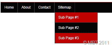
Create a Drop Down Menu In Blogger

If you wish to add the same menu to Blogger Template Designer templates then read this post -> [a href="http://www.mybloggertricks.com/2011/07/add-custom-drop-down-menu-to-templates.html" target="_blank"]Custom Drop Down menu[/a]


[a href="https://blogger.googleusercontent.com/img/b/R29vZ2xl/AVvXsEhwH9pMdG21AqTsXebJS2rnDrtJmJQCrbFl6x_pIt9yLTuM48hD7lEuzApkxZgPNexhyLg_ocg7AT9dfcSDJW1J90VbuOd4e57KDp4TEXA8U2DbwgUl2b_yhh8vEUwF5LTXCJiIpG2R4qI/s1600-h/image%25255B14%25255D.png"]image[/a]

      </ul>
    </div>

Replace # with your Page Links and the bolded text with relevant page names. The yellow highlighted code is responsible for the drop down menu. You can copy and paste it under any tab you want just before </li>

To add another tab just paste this code above </ul>

<li>
          <a href='#'>Tab Name</a>
        </li>
       

    3.   Now Go to Design > Edit HTML

    4.   Backup your template and search for ,

]]></b:skin>

     3.   Just above it paste the code below,

/*----- MBT Drop Down Menu ----*/


#mbtnavbar {
    background: #060505;
    width: 960px;
    color: #FFF;
        margin: 0px;
        padding: 0;
        position: relative;
        border-top:0px solid #960100;
        height:35px;

}


#mbtnav {
    margin: 0;
    padding: 0;
}
#mbtnav ul {
    float: left;
    list-style: none;
    margin: 0;
    padding: 0;
}
#mbtnav li {
    list-style: none;
    margin: 0;
    padding: 0;
        border-left:1px solid #333;
        border-right:1px solid #333;
        height:35px;
}
#mbtnav li a, #mbtnav li a:link, #mbtnav li a:visited {
    color: #FFF;
    display: block;
   font:normal 12px Helvetica, sans-serif;
   margin: 0;
    padding: 9px 12px 10px 12px;
        text-decoration: none;
       

}
#mbtnav li a:hover, #mbtnav li a:active {
    background: #BF0100;
    color: #FFF;
    display: block;
    text-decoration: none;
        margin: 0;
    padding: 9px 12px 10px 12px;


}

#mbtnav li {
    float: left;
    padding: 0;
}
#mbtnav li ul {
    z-index: 9999;
    position: absolute;
    left: -999em;
    height: auto;
    width: 160px;
    margin: 0;
    padding: 0;
}
#mbtnav li ul a {
    width: 140px;
}
#mbtnav li ul ul {
    margin: -25px 0 0 161px;
}
#mbtnav li:hover ul ul, #mbtnav li:hover ul ul ul, #mbtnav li.sfhover ul ul, #mbtnav li.sfhover ul ul ul {
    left: -999em;
}
#mbtnav li:hover ul, #mbtnav li li:hover ul, #mbtnav li li li:hover ul, #mbtnav li.sfhover ul, #mbtnav li li.sfhover ul, #mbtnav li li li.sfhover ul {
    left: auto;
}
#mbtnav li:hover, #mbtnav li.sfhover {
    position: static;
}

#mbtnav li li a, #mbtnav li li a:link, #mbtnav li li a:visited {
    background: #BF0100;
    width: 120px;
    color: #FFF;
    display: block;
    font:normal 12px Helvetica, sans-serif;
    margin: 0;
    padding: 9px 12px 10px 12px;
        text-decoration: none;
z-index:9999;
border-bottom:1px dotted #333;

   
}
#mbtnav li li a:hover, #mbtnavli li a:active {
    background: #060505;
    color: #FFF;
    display: block;
    margin: 0;
    padding: 9px 12px 10px 12px;
        text-decoration: none;
}

Make these changes:

  • Change #060505 to change background color of the Main menu
  • Change  the yellow highlighted text to change font color, size and family
  • Change #BF0100 to change the background of a tab on mouse hover
  • Change #BF0100 to change the background color of the drop down menu
  • Change #060505 to change the background color of drop down menu on mouse hover

      4.    Save your template and you are done!


Visit your Blogs to see a beautiful Navigation menu just below Header. Have Fun! :)

If you have any questions feel free to post them.

Source: http://www.mybloggertricks.com/2011/07/create-drop-down-menu-in-blogger.html

Custom Facebook Like Box With Mouse Hover Effect

Custom Like Box HTML and JavaScript Code

Place your like box anywhere you like by using this code,

<style>
    #mbtlikebox{
      color: #365899;
      font: bold 11px arial;
      background:#ECEEF5;
      padding:3px !important;
      margin:5px 0px!important;
      border:1px solid #E1E4ED;
     -moz-border-radius:3px;
     -webkit-border-radius:3px;
      width:290px;
    }

#mbtlikebox:hover{
     border:1px solid #6383C1;
    }
</style>
<script type="text/javascript" src="http://static.ak.connect.facebook.com/js/api_lib/v0.4/FeatureLoader.js.php/en_US"></script>
    <script type="text/javascript">FB.init("");</script>
    <fb:fan profile_id="LIKE PAGE ID" stream="0" connections="10" width="350px" height="200px" header="0" logobar="0"   css="STYLESHEET LINK"></fb:fan>
<div id="mbtlikebox"><a rel="nofollow" target="_blank" style="text-decoration:none; color:#365899;" href="LIKE PAGE URL">Visit the Like Page »</a><div style="float:right"><a href='http://www.mybloggertricks.com' style="text-decoration:none; color:#365899;">Widgets »</a></div></div>

Make these changes:

  • Replace LIKE PAGE ID with your Like Page User ID. Read the previous post for help.
  • Replace STYLESHEET LINK with the link of your CSS file that you uploaded as made clear in our previous post.
  • Replace LIKE PAGE URL with your Like Page link

That's it!

Credits

All customization credits goes to MBT blog and [a href="http://www.daddydesign.com/wordpress/how-to-customize-your-facebook-fan-box/" rel="nofollow" target="_blank"]DaddyDesigns[/a]. Web developers and bloggers are requested to link back to them if they wish to share the codes above with their readers.

Troubleshooting

If you faced any problems or received Facebook rendering errors then you may kindly read this post:

  • [a href="http://www.mybloggertricks.com/2011/06/fixing-facebook-like-box-rendering.html" target="_blank"]Fix Like Box errors[/a] 

If you needed any help with regard to customizing the colors and look of Like box then feel free to post your query. Would be a pleasure to help you. Peace and blessings.

Source: http://www.mybloggertricks.com/2011/07/custom-facebook-like-box-with-mouse.html

Create a Drop Down Menu In Facebook Style With Rounded Borders

The [a href="http://www.mybloggertricks.com/2011/07/create-drop-down-menu-in-blogger.html" target="_blank"]Drop Down Menu[/a] code that I provided earlier can be used as a structure to design any navigation menu you like. I have designed a drop down menu using Facebook as inspiration. You can fully customize this menu and can add colors and fonts of your preference too. The new thing about this menu is that it also contains a sub drop down menu and all menus have rounded borders. So now you organize your pages even more beautifully. I have made the installation even more easier. If you use the watermark template or any other Blogger Designer Template then you must read the post below after applying this tutorial,

[a name='more'][/a]
  • Adding Drop down menu to New [a href="http://www.mybloggertricks.com/2011/07/add-custom-drop-down-menu-to-templates.html" target="_blank"]Blogger Designer Templates[/a]

[a href="https://blogger.googleusercontent.com/img/b/R29vZ2xl/AVvXsEjKvA_V6ch6ZT1VlYyFNUnD1gthEK3OMgNYwCrC4j-HHnaqYrOunMC0GtnhSoEuE-cEPdW8OhuRHMaj1eeSLy-ulbDZ3oSOdIPonXhXeSDM6IUZNeKxiC_KaHeCIUH9CBn58Gpwb6Zelrc/s1600-h/image%25255B11%25255D.png"]Facebook Drop down menu[/a]

[a href="http://zailab.blogspot.com/" rel="nofollow" target="_blank"]Live Demo[/a]

Adding The Drop Down Menu To Blogger

     1.   Go To Blogger > Design and select a HTML/JavaScript widget

      2. Paste the following code inside it,

<style>
#mbtnavbar {
    background: #3B5998;
    width: 100%;
 
    color: #FFF;
        margin: 10px 0;
        padding: 0;
        position: relative;
        border-top:0px solid #960100;
        height:35px;

}


#mbtnav {
    margin: 0;
    padding: 0;
}
#mbtnav ul {
    float: left;
    list-style: none;
    margin: 0;
    padding: 0;
}
#mbtnav li {
    list-style: none;
    margin: 0;
    padding: 0;
      
}
#mbtnav li a, #mbtnav li a:link, #mbtnav li a:visited {
    color: #FFF;
    display: block;
   font:bold 12px Helvetica, sans-serif;
   margin: 0;
    padding: 9px 12px 11px 12px;
        text-decoration: none;
        border-right:0px solid #627AAD;

}
#mbtnav li a:hover, #mbtnav li a:active {
    background: #627AAD;
    color: #FFF;
    display: block;
    text-decoration: none;
        margin: 0;
    padding: 9px 12px 11px 12px;


}

#mbtnav li {
    float: left;
    padding: 0;
}
#mbtnav li ul {
    z-index: 9999;
    position: absolute;
    left: -999em;
    height: auto;
    width: 160px;
    margin: 0;
    padding: 0;
}
#mbtnav li ul a {
    width: 140px;
}
#mbtnav li ul ul {
    margin: -25px 0 0 161px;
}

#mbtnav li:hover ul ul, #mbtnav li:hover ul ul ul, #mbtnav li.sfhover ul ul, #mbtnav li.sfhover ul ul ul {
    left: -999em;
}
#mbtnav li:hover ul, #mbtnav li li:hover ul, #mbtnav li li li:hover ul, #mbtnav li.sfhover ul, #mbtnav li li.sfhover ul, #mbtnav li li li.sfhover ul {
    left: auto;
}
#mbtnav li:hover, #mbtnav li.sfhover {
    position: static;
}
#mbtnav li li a, #mbtnav li li a:link, #mbtnav li li a:visited {
    background: #EDEFF4;
    width: 120px;
    color: #3B5998;
    display: block;
    font:normal 12px Helvetica, sans-serif;
    margin: 1px 0 0 0;
    padding: 9px 12px 10px 12px;
        text-decoration: none;
z-index:9999;
border:1px solid #ddd;

-moz-border-radius:4px;
-webkit-border-radius:4px;

  
}
#mbtnav li li a:hover, #mbtnav li li a:active {
    background: #627AAD;
    color: #FFF;
    display: block;
  
}


#mbtnav li li li a, #mbtnav li li li a:link, #mbtnav li li li a:visited {

    background: #EDEFF4;
    width: 120px;
    color: #3B5998;
    display: block;
    font:normal 12px Helvetica, sans-serif;
    padding: 9px 12px 10px 12px;
        text-decoration: none;
z-index:9999;
border:1px solid #ddd;
    margin: 1px 0 0  -14px;
  
  
}
#mbtnav li li li a:hover, #mbtnav li li li a:active {
    background: #627AAD;
    color: #FFF;
    display: block;
}

</style>
<div id='mbtnavbar'>
          <ul id='mbtnav'>
            <li>
              <a href='#'>Home</a>
            </li>
            <li>
              <a href='#'>About</a>
           </li>
            <li>
              <a href='#'>Contact</a>
            </li>
      <li>
               <a href='#'>Sitemap ▼</a>

                <ul>
                    <li><a href='#'>Sub Page #1</a></li>
                    <li><a href='#'>Sub Page #2</a></li>
                    <li><a href='#'>Sub Page #3</a>
               
   <ul>
                    <li><a href='#'>Sub Sub Page #1</a></li>
                    <li><a href='#'>Sub Sub Page #2</a></li>
                    <li><a href='#'>Sub Sub Page #3</a></li>
                  </ul>

</li>
                  </ul>
            </li>

          </ul>
        </div>


The colors and font family and size can be changed in the same way as in the previous post. The only thing you need to understand is how to control the number of link lists. The code in purple is responsible for the appearance of the first drop down menu and the highlighted yellow code controls the sub drop down menus. If you wish to increase or decrease the number of tabs then simply add or remove a code like this,

<li>

<a href="#">Tab Name</a>

</li>

Where # should be replaced with Page Link and the corresponding text should be replaced with the Tab name.

I will creating more menus using the same HTML structure. The above code is created without using any Jquery, Images or scripts. It is pure CSS and html and it will help you [a href="http://www.mybloggertricks.com/2011/06/compress-css-and-html-to-reduce-site.html" target="_blank"]speed up your website[/a] load time too. Feel free to ask for any help if needed.

Source: http://www.mybloggertricks.com/2011/07/create-drop-down-menu-in-facebook-style.html

Good News! Facebook Like Box Can Now Be Customized

After the beautiful [a href="http://www.mybloggertricks.com/2011/06/surprise-mbt-developed-its-first.html" target="_blank"]Facebook Iframe tabs[/a] experience, I started understanding on how to customize Facebook plugins. Due to tons of helpful online support from forums and blogs, MBT blog is proud to announce that the new Facebook Like Box can now easily be customized using pure CSS. Detail Info on this will be shared on my next post. For the time being see it appearing in action at the top with complete custom look and feel. Thanks for being a great support and motivation.

[a name='more'][/a]

I must mention here that so far all these developments are made possible without the support of Facebook [a href="http://developers.facebook.com/" target="_blank"]Developers Page[/a] authors. The info guides provided by these authors on Facebook Developing pages are worth to be called unhelpful irritating details.

Source: http://www.mybloggertricks.com/2011/06/good-news-facebook-like-box-can-now-be.html

Zoom In/Out Images On Mouse Hover With Single Image


[a href="https://blogger.googleusercontent.com/img/b/R29vZ2xl/AVvXsEgYKsLOOhrdnF8tDOJH4PTNFprN2tZxTMfkrDpg_NnfG0JpFrHGxH2QtsFmYtCcg_OJR7Z-u16WYJtoc6VUC-CF_dxCWWBkv1wQbbEznYaGSieBNz3ZJCmt9wFYqh_UU7pIomVe7jHHKWU/s1600-h/zoom-images%25255B10%25255D.png"]zoom-images[/a]There are many tutorials online which show users how to achieve a hover effect on their buttons and other images using mouse hover and they often instruct to use a second, larger image.  Another method used is using jQuery to enlarge the size of the image. But with a little bit of trickery, this can be done solely using Css3 and normal html.

Here is a demo:


[a href="http://www.blogger.com/post-edit.g?blogID=8193278726666811965&postID=4960894755779778317&from=pencil#demo"]Live Demo[/a]


Note : This trick is best viewed in the latest version of any browser other than IE.

This tutorial has been split into two parts:


  1. CSS implementation

  2. HTML Implementation


CSS implementation:


1. Go To Blogger > Design > Edit HTML

2. and search for


]]></b:skin>


3. Now right above it, paste this code:


/*------- MBT ZOOM-OUT ZOOM-IN -------*/

.mbtzoom {
padding:5px;
position:fixed;
bottom: 35px;
right:10px;
cursor: pointer;
text-decoration: none;
border: 0px solid transparent;
-moz-transition: all 0.3s ease-out; 
-o-transition: all 0.3s ease-out; 
-webkit-transition: all 0.3s ease-out; 
-ms-transition: all 0.3s ease-out; 
transition: all 0.3s ease-out; 
}

.mbtzoom:hover  {
  zoom: 2;
  text-enlarge: 2;
  -moz-transform: scale(2);
  -o-transform: scale(2);
  transform: scale(2);
}


Same procedure as the other option, edit the values to your picture, and change the zoom to how big you want the picture after the transition.


HTML Implementation:


Now whenever you wish to apply the zoom effect to any image you want simply use this code,


<a href="URL OF PAGE" class="mbtzoom"><img  width="60px" height="60px" src="IMAGE LINK" alt="back to top"  /></a>


  • Replace URL OF PAGE with the page link. On clicking the image the user will be taken to that page

  • Replace IMAGE LINK with the link of the picture

  • Make sure to Keep width and height equal to half the size of original image. For example if the image size is 100px by 100px then set width="50px" and height="50px"


That’s it! Your image should be zooming/enlarging beautifully on your blog/website!


DEMO


As a [a href="" name="demo"]DEMO[/a] simply paste this code on MBT HTML Editor


<style>
.mbtzoom {
padding:5px;
position:fixed;
bottom: 35px;
right:10px;
cursor: pointer;
text-decoration: none;
border: 0px solid transparent;
-moz-transition: all 0.3s ease-out; 
-o-transition: all 0.3s ease-out; 
-webkit-transition: all 0.3s ease-out; 
-ms-transition: all 0.3s ease-out; 
transition: all 0.3s ease-out; 
}

.mbtzoom:hover  {
  zoom: 2;
  text-enlarge: 2;
  -moz-transform: scale(2);
  -o-transform: scale(2);
  transform: scale(2);
}
</style>

<a href="#" class="mbtzoom"><img  width="60px" height="60px" src="https://blogger.googleusercontent.com/img/b/R29vZ2xl/AVvXsEiHDe291OD-F5IaoHyGeRS_GYVoWlLigVpHWtauJP0keYRPTHXmwBPN1vBE9qqkEjN19VDRN-snRREnQGqcpd7wAjKAZb8zSdeTULJvzdCzYLzJbQhqgnYEExFEePuspZIKuQJYbZpFUI4/s800/rss-128.png" alt="back to top"  /></a>


Anims


About the Guest Author:

Anims is freelance web designer and enjoys playing around with and learning coding in his free time. He likes to write about Web Technologies such as HTML, CSS and SEO.


Source: http://www.mybloggertricks.com/2011/06/zoom-inout-images-on-mouse-hover-with.html

Customize Facebook Like Box With CSS


[a href="https://blogger.googleusercontent.com/img/b/R29vZ2xl/AVvXsEhX_YcFT4PGjmfaieozfRkIdq0-TiYdEVbZw1a9VfrQVGZ-3UOmShTKsbodNUcoSoF7byvK5cPqZDe008gtR7Spb7EpJI3c7Alz4DD6SvfvQ4ohN7NdA4KkABua_mbCdA1F3kQiOa1346c/s1600-h/custom-like-box%25255B6%25255D.png"]custom-like-box[/a]Styling Facebook plugins is unfortunately not an easy job because very limited details are shared on the Facebook [a href="http://developers.facebook.com/docs/reference/plugins/like-box/" target="_blank"]Developers page[/a]. Custom plugins help you to stand out as a brand and promote your business well. In April 2010, [a href="http://www.daddydesign.com/wordpress/how-to-customize-your-facebook-fan-box/" target="_blank"]Daddydesigns[/a] published a tutorial on how to style and apply modifications to Facebook Fan box. Their tutorial was well entertained but with the introduction of Facebook Like Box instead of Fan Box, the change in algorithms made it difficult to modify the plugin using the same guide. After several trials and errors, we managed somehow to make the necessary small changes made by DaddyDesigns to fully customize the Like box with custom flavors of fonts and colors. This would surely have not been possible with their brilliant help.


I have made this tutorial as easy to implement as possible. You just need to carefully follow the easy steps below. I have divided the tutorial in two parts:


  1. [a href="http://www.blogger.com/blogger.g?blogID=8193278726666811965#css"]Creating The style sheet for Like Box[/a]

  2. [a href="http://www.blogger.com/blogger.g?blogID=8193278726666811965#code"]Creating a custom Like Box code[/a]


1. Creating the Stylesheet For Like Box


[a href="https://blogger.googleusercontent.com/img/b/R29vZ2xl/AVvXsEguZsqY9bz07nYOjHomQxOKj7E9beTqYLfQk5LdqnH_UQnPQN-v9ttE7g3i2TRw937LDNzUErs7A4lSjSCYjqh2y_FnYpio-PqguO03JW_cBqwxc72ge4NKgzSN5iipRLshVlJ7s1zbEVU/s1600-h/image%25255B4%25255D.png"]Custom like box[/a]

Creating a style sheet is really easy. Just do this,

    1.  Copy and paste the code below inside a notepad


/*---------------MBT's Custom Like Box Start--------------*/

.fan_box a:hover{

  text-decoration: none;

}


.fan_box .full_widget{

  height: 200px;

  border: 0 !important;

  background: none !important;

  position: relative;

}


.fan_box .connect_top{

  background: none !important;

  padding: 0 !important;

}


.fan_box .profileimage, .fan_box .name_block{

  display: none;

}


.fan_box .connect_action{

  padding: 0 !important;

}


.fan_box .connections{

  padding: 0 !important;

  border: 0 !important;

  font-family: Arial, Helvetica, sans-serif;

  font-size: 11px;

  font-weight: bold;

  color: #666;

}


span.total{

  color: #0080ff;

  font-weight: bold;

}


.fan_box .connections .connections_grid {

  padding-top: 10px !important;

}


.fan_box .connections_grid .grid_item{

  padding: 0 10px 10px 0 !important;

}


.fan_box .connections_grid .grid_item .name{

  font-family: "lucida grande",tahoma,verdana,arial,sans-serif;

  font-weight: normal;

  color: #289728 !important;

  padding-top: 1px !important;

}


.fan_box .connect_widget{

position: absolute;

bottom: 0;

left: 0px;

margin: 0 !important;

}


.fan_box .connect_widget .connect_widget_interactive_area {

margin: 0 !important;

}


.fan_box .connect_widget td.connect_widget_vertical_center {

padding: 0 !important;

}


/*---------------MBT's Custom Like Box End--------------*/

To keep it simple make these changes:


  • To change the font size edit font-size: 11px;

  • Replace the heading color ( #0080ff ) with a color of your choice. You can use our color generator tool

  • Replace the Profile Nick Names text color ( #289728 ) with one of your choice.


      2.   Now save the file by going to File > Save as

Save the file with the extension FB.css as shown below,

[a href="https://blogger.googleusercontent.com/img/b/R29vZ2xl/AVvXsEjx5rVzMZveWz5tXwcFtGczJbQ-ZDnBjFWlErIrfiNVVb9tReW17QO22_iSMLAnuoDXOSx0BlQ8LlfD9WLxSw6FgRn-MfPXtZVmoLdQXwTB_lIUIgju_swVjfWp9UW6FgqURlQb7F0XiC0/s1600-h/image%25255B9%25255D.png"]css extension[/a]

      3.   Finally upload the file on your hosting server or you can try any other free hosting service. I recommend [a href="http://www.mdn.fm/register/?r=7971" rel="nofollow" target="_blank"]mydatanest[/a]

      4.   Once you have uploaded the stylesheet file, you will be provided with a direct link to it. Keep it safe as we would need it later.

     5.    You are done!


2. Creating a [a href="http://www.blogger.com/blogger.g?blogID=8193278726666811965" name="code"]Custom Like Box Code[/a]


Instead of using the new code provided on the developers page, we will use and modify the code provided by daddydesigns. This is the modified code you need to use:


<script type="text/javascript" src="http://static.ak.connect.facebook.com/js/api_lib/v0.4/FeatureLoader.js.php/en_US"></script>

<script type="text/javascript">FB.init("");</script>

<fb:fan profile_id="LIKE PAGE ID" stream="0" connections="10" width="300px" height="200px" header="0" logobar="0"   css="STYLE SHEET LINK"></fb:fan>

The above code structure consists of 4 important sections which must be filled properly.


  1. Like Page ID

  2. Connections i.e. Number of Profile Faces/pics

  3. Width and Height Dimensions

  4. Stylesheet link


Make these changes:


  • Replace  with the 12-15 digit numeric ID of your Facebook Like Page. You can find this ID inside your Like Page URL. For example: The URL of my like Page is,


https://www.facebook.com/pages/My-Blogger-Tricks/147104632016744


  • I have kept the number of profile pics denoted by connections equal to 10. You can reduce it if you want.

  • Replace STYLE SHEET LINK with the link of the stylesheet your previously uploaded. I will mention later how to create


Your Custom Facebook Like Box is now ready to be served! That's All. Paste this code anywhere you want and your personalized and styled box will show up just perfectly. If you face any problems just let me know. I will publish more designs and tutorials on this topic within this week.


Credits


Readers are requested to kindly link back to this page if they wish to share this working tutorial with their visitors. It's the only tutorial published after daddydesigns tut which provides a modified solution.
Source: http://www.mybloggertricks.com/2011/06/customize-facebook-like-box-with-css.html

Change Syntax Highlighter Color Theme In Blogger

[a href="https://blogger.googleusercontent.com/img/b/R29vZ2xl/AVvXsEgvgoGnVCIplgMkbRCG7stiuSMNXRdLlfOf4hbAmaxbBHWHW3LDriGaBZhrzuLb2S5b7U9CV-BsSOYIQoaA0TDzeQXMwXVG0N3h-6lfBiiQryeE3-W3lkpAw7ppqPPKrT6Jy_nkL8oX3Sg/s1600-h/SYNTAX-HIGHLIGHTER-THEMES%25255B8%25255D.gif"]SYNTAX-HIGHLIGHTER-THEMES[/a]Syntax highlighter is the big name that you see on major tutorial sharing blogs may that be Wordpress or Blogger. Web Owners who use it are growing in numbers. In the last post we discuss how to add Syntax Highlighter to your Blogger Blogs and today we will learn how to change its look and feel and customize it to some extent with 7 different color themes available so far.

[a name='more'][/a]


If you don't understand what I am talking then you may kindly read this post first,

  • Add [a href="http://www.mybloggertricks.com/2011/06/add-syntax-highlighter-to-blogspot.html" target="_blank"]Syntax Highlighter[/a] in Blogger

Customize Syntax Highlighter

I assume that you have already added the highlighter to your blogs. Now you just need to follow these easy steps,

  1. Go To Blogger > Design > Edit HTML
  2. Search For this code,

<link href='http://alexgorbatchev.com/pub/sh/current/styles/shThemeDefault.css' rel='stylesheet' type='text/css'/>

    3.   And replace it with any of the following theme code:

PS: Click the images for DEMO.

Django theme

[a href="http://alexgorbatchev.com/SyntaxHighlighter/manual/themes/django.html" target="_blank"]image[/a]

<link href='http://alexgorbatchev.com/pub/sh/current/styles/shThemeDjango.css' rel='stylesheet' type='text/css'/>


Emacs theme

[a href="http://alexgorbatchev.com/SyntaxHighlighter/manual/themes/emacs.html" target="_blank"]image[/a]

<link href='http://alexgorbatchev.com/pub/sh/current/styles/shThemeEmacs.css' rel='stylesheet' type='text/css'/>

Fade to Grey theme

[a href="http://alexgorbatchev.com/SyntaxHighlighter/manual/themes/fadetogrey.html" target="_blank"]image[/a]

<link href='http://alexgorbatchev.com/pub/sh/current/styles/shThemeFadeToGrey.css' rel='stylesheet' type='text/css'/>


Eclipse theme

[a href="http://alexgorbatchev.com/SyntaxHighlighter/manual/themes/eclipse.html" target="_blank"]image[/a]

<link href='http://alexgorbatchev.com/pub/sh/current/styles/shThemeEclipse.css' rel='stylesheet' type='text/css'/>

Midnight theme


[a href="http://alexgorbatchev.com/SyntaxHighlighter/manual/themes/midnight.html" target="_blank"]image[/a]

<link href='http://alexgorbatchev.com/pub/sh/current/styles/shThemeMidnight.css' rel='stylesheet' type='text/css'/>

RDark theme


[a href="http://alexgorbatchev.com/SyntaxHighlighter/manual/themes/rdark.html" target="_blank"]image[/a]

<link href='http://alexgorbatchev.com/pub/sh/current/styles/shThemeRDark.css' rel='stylesheet' type='text/css'/>


    4.   Save your template and you are done!

Visit your blogs to see the Magic! :)

Source: http://www.mybloggertricks.com/2011/06/change-syntax-highlighter-color-theme.html

Rotate/Animate Images Using CSS3 Without JavaScript!

animated imageCSS3 has many new powers with which we can further enhance our websites, without extensive knowledge of JavaScript, or without really effecting our website’s loading time. With less than ten lines of CSS coding, we can achieve each of the following effects.  Changing CSS properties on mouse-hover and using CSS3 transitions were used for these enhancements. You can now easily animate the images on your WordPress or Blogger blogs using the simple image opacity effect below that rotates the image on mouse hover.

[a name='more'][/a]
[a href="http://zailab.blogspot.com/2011/06/link-nudging-and-image-opacity-effect.html" target="_blank"]Live Demo[/a]


Note: You need a up to date browser to fully experience the effects. This includes pretty much the latest version of any browser other than IE.

Animating Images In Blogger With CSS3

  1. Go To Blogger > Design > Edit HTML
  2. Backup your template
  3. Search for ]]></b:skin>
  4. Just above it paste the following code


/* --------- MBT Image Rotation ----- */
.opacity  {
opacity: 0.5;
margin-left: 50px;
-moz-transition: all 0.5s ease-out;  
-o-transition: all 0.5s ease-out;  
-webkit-transition: all 0.5s ease-out;  
-ms-transition: all 0.5s ease-out;  
transition: all 0.5s ease-out;
-moz-transform: rotate(5deg);  
-o-transform: rotate(5deg);  
-webkit-transform: rotate(5deg);  
-ms-transform: rotate(5deg);  
transform: rotate(5deg);  
filter: progid:DXImageTransform.Microsoft.Matrix(
                    M11=0.9961946980917455, M12=-0.08715574274765817, M21=0.08715574274765817, M22=0.9961946980917455, sizingMethod='auto expand');
zoom: 1;  
}
.opacity:hover  {
opacity: 1;
margin-left: 0px;
-moz-transform: rotate(0deg);  
-o-transform: rotate(0deg);  
-webkit-transform: rotate(0deg);  
-ms-transform: rotate(0deg);  
transform: rotate(0deg);  
filter: progid:DXImageTransform.Microsoft.Matrix(
                    M11=1, M12=0, M21=0, M22=1, sizingMethod='auto expand');
zoom: 1.3;
-moz-box-shadow: 1px 1px 4px #000;
-webkit-box-shadow: 1px 1px 4px #000;
box-shadow: 1px 1px 4px #000;
}

Edit the bolded values to increase or decrease the angle of rotation.   

5. Save your template and done!

How it works?

Whenever you wish to implement this effect, simply add the following code in Edit HTML mode of your Post Editor, to turn or rotate the images:

<img src="IMAGE LINK HERE" border="0" alt="Image Description hereclass="opacity" />

Make these changes:

  • Replace IMAGE LINK HERE with the [a href="http://www.mybloggertricks.com/2009/11/create-blogger-backup-for-images-and.html" target="_blank"]Image URL[/a] of the pic
  • Replace Image Description here with Image name or description. Optional


We hope you enjoyed the effect, and happy blogging! Peace!

You may also like these effects:

  • [a href="http://www.mybloggertricks.com/2010/02/top-10-widely-used-image-hover-effects.html" target="_blank"]10 widely used image hover effects[/a]
  • [a href="http://www.mybloggertricks.com/2009/09/learn-how-to-add-image-pop-up-and.html" target="_blank"]Image Pop up and Opacity Effect[/a]
Anims


About the Guest Author:

Anims is freelance web designer and enjoys playing around with and learning coding in his free time. He likes to write about Web Technologies such as HTML, CSS and SEO. He is a valuable MBT contributor.

Source: http://www.mybloggertricks.com/2011/06/rotateanimate-images-using-css3-without.html

Link Nudging To Animate Images Using CSS3

<a href="ADD URL HERE" class="mbt-nudge">ADD TEXT HERE</a>

  • Replace ADD URL HERE with your link like http://xyz.com
  • Replace ADD TEXT HERE with the text that will display the link

For Image Nudging use this:

<img src="IMAGE LINK HERE" border="0" alt="Image Description hereclass="mbt-nudge" />

Make these changes:

  • Replace IMAGE LINK HERE with the [a href="http://www.mybloggertricks.com/2009/11/create-blogger-backup-for-images-and.html" target="_blank"]Image URL[/a] of the pic
  • Replace Image Description here with Image name or description. Optional


Take a look at your blogs and see the difference!  Here are some other tutorials which also offer some customization which might be of interest to you:

  • [a href="http://www.mybloggertricks.com/2011/06/rotateanimate-images-using-css3-without.html" target="_blank"]Rotate/Animate Images[/a]
  • [a href="http://www.mybloggertricks.com/2010/02/top-10-widely-used-image-hover-effects.html" target="_blank"]10 widely used image hover effects[/a]
  • [a href="http://www.mybloggertricks.com/2009/09/learn-how-to-add-image-pop-up-and.html" target="_blank"]Image Pop up and Opacity Effect[/a]
Anims


About the Guest Author:

Anims is freelance web designer and enjoys playing around with and learning coding in his free time. He likes to write about Web Technologies such as HTML, CSS and SEO. He is a valuable MBT contributor.

Source: http://www.mybloggertricks.com/2011/06/link-nudging-to-animate-images-using.html

10 Ways To Style and Create "Read More" Links In Blogger

   5.   And paste your selected [a href="#readmore"]Read More Link style code[/a] just above it.

   6.   Next search for this,

<data:post.body/>

   7.    Just below it you will find the read more link code similar to this one,

<b:if cond='data:blog.pageType != "item"'>
<a expr:href='data:post.url'>

<div style="text-align: right;">Read More ->></div></a>
</b:if>


If you are using a read more link button then the code will look something like this,

<b:if cond='data:blog.pageType != "item"'>
<a expr:href='data:post.url'>

<div style="text-align: right;">< img src=http://xyz.com border="0"/></div></a>
</b:if>

In both the cases, simply replace the highlighted code with this,


class="MBT-readmore"

    8.   Save your template and you are done!

Ten "Read More" Link Styles

Now select one of [a name="readmore"]these styles[/a] for step#5

Style#1:

Read More Button


/*-------------------------- Narrow black Orange-------------*/
.MBT-readmore{
background:#fff;
text-align:right;
cursor:pointer;
color:#EB7F17;
margin:5px 0;
border-left:400px dashed #474747;
border-right:2px solid #474747;
border-top:2px solid #474747;
border-bottom:2px solid #474747;
padding:2px;
-moz-border-radius:6px;
-webkit-border-radius:6px;
font:bold 11px sans-serif;
}
.MBT-readmore:hover{
background:#EB7F17;
color:#fff;
border-left:400px dashed #474747;
border-right:2px solid #EB7F17;
border-top:2px solid #EB7F17;
border-bottom:2px solid #EB7F17;
}
.MBT-readmore a {
color:#fff;
text-decoration:none;
}

.MBT-readmore a:hover {
color:#fff;
text-decoration:none;
}

Style#2:

Read More Button


/*------------Light Purple long----------------------*/
.MBT-readmore{
background:#fff;
text-align:right;
cursor:pointer;
color:#6882C7;
margin:5px 0;
border-left:400px solid #6882C7;
border-right:2px solid #6882C7;
border-top:2px solid #6882C7;
border-bottom:2px solid #6882C7;
padding:1px 5px 1px 1px;
-moz-border-radius:6px;
-webkit-border-radius:6px;
font:bold 11px sans-serif;
}
.MBT-readmore:hover{
color:#000800;
border-left:50px solid #6882C7;
border-right:2px solid #6882C7;
border-top:2px solid #6882C7;
border-bottom:2px solid #6882C7;
}
.MBT-readmore a {
color:#fff;
text-decoration:none;
}

.MBT-readmore a:hover {
color:#fff;
text-decoration:none;
}

Style#3:

Read More Button


/*---------------- Rectangle left border-----------*/
.MBT-readmore{
background:#fff;
text-align:right;
cursor:pointer;
color:#009999;
margin:5px 0;
float:right;

border-right:2px solid #009999;
border-left:10px solid #009999;
border-bottom:2px solid #009999;
border-top:2px solid #009999;

padding:5px;
font:bold 11px sans-serif;
}
.MBT-readmore:hover{
background:#fff;
font:bold 11px sans-serif;
color:#006B6B;

border-right:2px dotted #009999;
border-left:10px solid #006B6B;
border-bottom:2px dotted #009999;
border-top:2px dotted #009999;
}

.MBT-readmore a {
color:#fff;
text-decoration:none;
}

.MBT-readmore a:hover {
color:#fff;
text-decoration:none;
}

Style#4:

Read More Button


/*-------------- Pink Left right -----------*/
.MBT-readmore{
background:#fff;
text-align:right;
cursor:pointer;
color:#FE80DF;
margin:5px 0;
float:right;
border-right:2px solid #FE80DF;
border-left:2px solid #FE80DF;
padding:5px;
-moz-border-radius:6px;
-webkit-border-radius:6px;
font:bold 11px sans-serif;
}
.MBT-readmore:hover{
background:#fff;
font:bold 11px sans-serif;
color:#CC0099;
border-right:2px solid #CC0099;
border-left:2px solid #CC0099;
}
.MBT-readmore a {
color:#fff;
text-decoration:none;
}

.MBT-readmore a:hover {
color:#fff;
text-decoration:none;
}

Style#5:

Read More Button


/*------------- Brown top Bottom----------*/
.MBT-readmore{
background:#fff;
text-align:right;
cursor:pointer;
color:#B26B00;
margin:5px 0;
float:right;
border-top:2px solid #ddd;
border-bottom:2px solid #ddd;
padding:5px;
-moz-border-radius:6px;
-webkit-border-radius:6px;
font:bold 11px sans-serif;
}
.MBT-readmore:hover{
background:#fff;
font:bold 11px sans-serif;
color:#B26B00;
border-top:2px solid #B26B00;
border-bottom:2px solid #B26B00;
}
.MBT-readmore a {
color:#fff;
text-decoration:none;
}

.MBT-readmore a:hover {
color:#fff;
text-decoration:none;
}

Style#6:

Read More Link


/*-------------- Blue Blank-----------------*/

.MBT-readmore{
background:#0080ff;
text-align:right;
cursor:pointer;
color:#Fff;
margin:5px 0;
float:right;
border:2px solid #ddd;
padding:5px;
-moz-border-radius:6px;
-webkit-border-radius:6px;
font:bold 11px sans-serif;
}
.MBT-readmore:hover{
background:#FFf;
font:bold 11px sans-serif;
color:#0080ff;
border:3px dotted #ddd;
}
.MBT-readmore a {
color:#fff;
text-decoration:none;
}

.MBT-readmore a:hover {
color:#fff;
text-decoration:none;
}

Style#7:

Read More Link

/*------------- Red + Dark Red------------*/

.MBT-readmore{
background:#fffff;
text-align:right;
cursor:pointer;
color:#FE8080;
margin:5px 0;
float:right;
border:2px solid #FE8080;
padding:5px;
-moz-border-radius:6px;
-webkit-border-radius:6px;
font:bold 11px sans-serif;
}
.MBT-readmore:hover{
background:#FFf;
font:bold 12px sans-serif;
color:#FF0000;
border:2px solid #FF0000;
}
.MBT-readmore a {
color:#fff;
text-decoration:none;
}

.MBT-readmore a:hover {
color:#fff;
text-decoration:none;
}

Style#8:

Read More Link


/*------------ White + Green -----------*/

.MBT-readmore{
background:#fffff;
text-align:right;
cursor:pointer;
color:#008000;
margin:5px 0;
float:right;
border:2px solid #ddd;
padding:5px;
-moz-border-radius:6px;
-webkit-border-radius:6px;
font:bold 11px sans-serif;
}
.MBT-readmore:hover{
background:#008000;
font:bold 11px sans-serif;
color:#fff;
border:2px solid #ddd;
}
.MBT-readmore a {
color:#fff;
text-decoration:none;
}

.MBT-readmore a:hover {
color:#fff;
text-decoration:none;
}

Style#9:

Read More Link


/*---------- Black --------------*/
.MBT-readmore{
background:#000800;
text-align:right;
cursor:pointer;
color:#fff;
margin:5px 0;
float:right;
border:2px solid #ddd;
padding:5px;
-moz-border-radius:6px;
-webkit-border-radius:6px;
font:bold 11px sans-serif;
}
.MBT-readmore:hover{
background:#fff;
font:bold 11px sans-serif;
color:#000800;
border:2px solid #000800;
}
.MBT-readmore a {
color:#fff;
text-decoration:none;
}

.MBT-readmore a:hover {
color:#fff;
text-decoration:none;
}

Style#10:

Read More Link


/*----------Orange One 1 ----------------*/

.MBT-readmore{
background:#EB7F17;
text-align:right;
cursor:pointer;
color:#fff;
margin:5px 0;
float:right;
border:none;
padding:5px;
-moz-border-radius:6px;
-webkit-border-radius:6px;
font:bold 11px sans-serif;
}
.MBT-readmore:hover{
background:#FFB93C;
}
.MBT-readmore a {
color:#fff;
text-decoration:none;
}

.MBT-readmore a:hover {
color:#fff;
text-decoration:none;
}


Customization:

You can easily make changes to the colors and style by understanding this general guide.

  • Edit .MBT-readmore To Change background, border and font colors in Active mode
  • Edit .MBT-readmore:hover To Change background, border and font colors when a user hovers mouse cursor on the button
  • Edit .MBT-readmore a To change the link color 
  • Edit .MBT-readmore a:hover To change the link color on mouse hover

You can use the [a href="http://www.mybloggertricks.com/2008/01/color-code-generator-and-color-wheel.html" target="_blank"]Color Generator Tool[/a] For changing colors.

I hope you like it and if you faced any problems then don't feel shy to ask a brother. :>

Source: http://www.mybloggertricks.com/2011/06/10-ways-to-style-and-create-more-links.html

Change Text Selection Highlighting Color in blogs

Styling Text Highlight color In Blogger


1. Go To Blogger > Design > Edit HTML

2. and search for ]]></b:skin>

3. Right above it, paste this code:


::-moz-selection  {
Background: #EB7F17;
color: #FFFFFF;
text-shadow: none; 
 
}
::selection   {
background: #EB7F17;
color: #FFFFFF;
text-shadow: none; 
 
}


Make these changes:

  • Replace #EB7F17 with the highlight color
  • Replace #FFFFFF with the Font color. By default the font color appears white.

You can choose a color using the [a href="http://www.mybloggertricks.com/2008/01/color-code-generator-and-color-wheel.html" target="_blank"]HexaDecimal[/a] Color Generator
Once you have entered your preferred color code, save your template, and see the difference!
Have fun blogging!


Anims


About the Guest Author:

Anims is freelance web designer and enjoys playing around with and learning coding in his free time. He likes to write about Web Technologies such as HTML, CSS and SEO.

Source: http://www.mybloggertricks.com/2011/06/change-text-selection-highlighting.html
 
Play : Agame | Y8 Games | Y3 Games
Copyright © 2011. Blogger Tips And Tricks 2012 - All Rights Reserved

Proudly powered by Blogger